In this documentation will walk you through the Hover Card block in Gutenify. A Hover Card Block in WordPress is used to display additional information when a user hovers their mouse over a specific element such as text, an image, a button, or an icon.
First, head over to your WordPress dashboard.
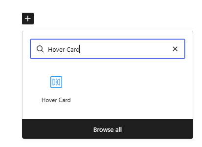
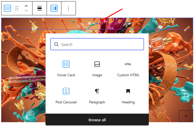
From the left-hand menu, select the post or pages ( Or Any post type) where you want to add a Hover Card block. Inside the block editor, click the “+” (Add Block) icon.
In the search field, type Hover Card. When the Hover Card block appears in the results, select to insert this into your content.
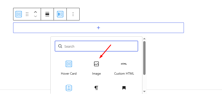
After adding the block, you can place any block inside it that you want to display within the hover card. For this example, you can add an Image block.
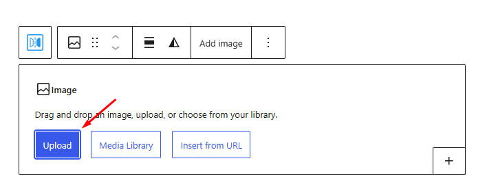
Once the image block is added, upload or select any image from your media library that you want to display as the main element of the hover card.
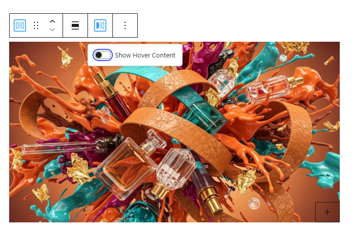
After uploading the image, enable the Show Hover Content option. Once this option is enabled, a plus (+) icon will appear, allowing you to add content that will be shown when a user hovers over the image.
Click the plus icon and insert blocks such as a Heading or Paragraph to add text to the hover card.
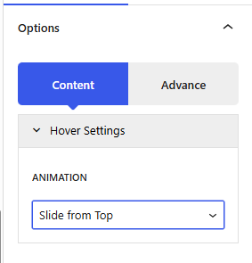
After adding your text, navigate to the Content tab and open the Hover Settings section. Here you can choose the animation style for how the hover content appears.
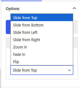
Available animation options include Zoom In, Flip, and Slide from Bottom, etc that allow you to select the effect that best matches your design and interaction style. For this example we are adding zoom it animation to our hover card.
Here are the results from its front end.
Once you’ve completed all your configurations, click Publish or Save to apply the changes.
If you need any help or run into any issues feel free to reach out to Gutenify’s support team.


