This is a pro block and requires activation of Gutenify Pro. Please refer to the Gutenify Pro page for more information.
To view live demo of tabs filter, kindly visit on the provided link. Tabs Demo
Tabs refer to a user interface pattern used to organize and display content in a space-efficient manner. Tabs are typically used to present different sections or categories of content within the same area, allowing users to switch between them easily.
How to Add Tabs? #
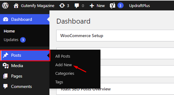
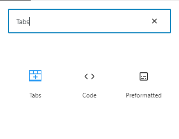
So, to add the tabs block into your website just go to WordPress dashboard menu

Note: Select the post or pages where you want to add tabs block.

Now, You’ll see that the section’s default three tabs having Tab1, Tab2, Tab3 with a place to add your content.

You can change the heading, width and color that you want to display in tabs that suit your needs.
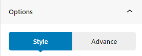
To edit the tabs block you have two options that are given in right sidebar:
- Style
- Advance

Style Tab #
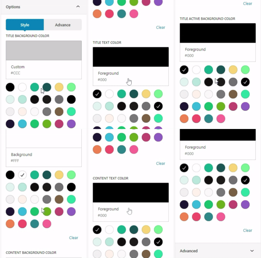
In the content tab, you can adjust Title Background Color, title text color, title active background color, title active text color, content background color, content text color to fit your preferences.

Advance Tab #
In the ‘Advanced’ tab, Gutenify provides responsive options for giving your widgets extra space and the ability to hide content on smaller devices. Additionally, it offers custom CSS for enhanced website design.
Learn more Here
When you’re satisfied with your tabs block, click “Publish”. Simply repeat the same procedure to add more blocks to your posts or pages.
Result after editing:
#


